( 00-01 )
ABOUT THE PROJECT
Printwox entered a printing market full of established names without years of reputation to lean on. It needed to look credible from day one, especially in a business where clients judge a printer by the quality of its output. The basic logo and materials it launched with did it no favors.
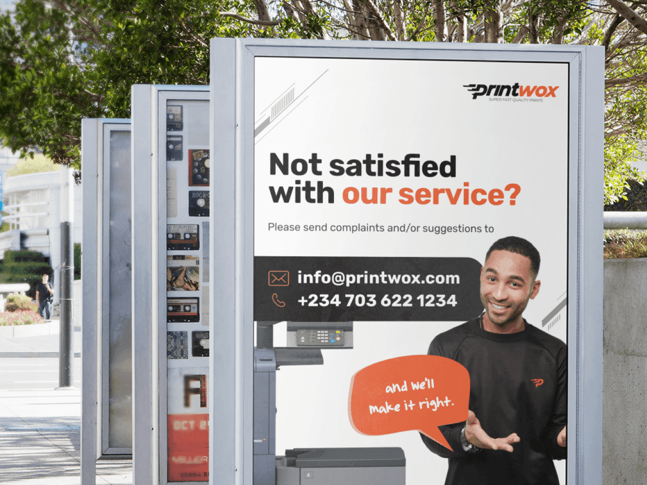
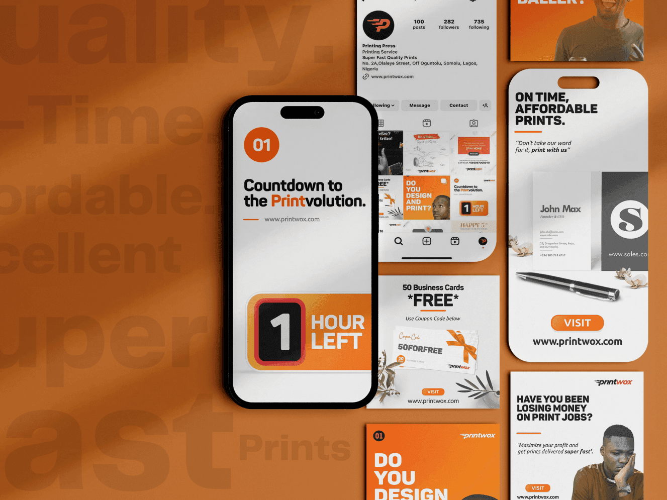
We built Printwox a proper identity from the ground up: a modern, professional logo and a look confident enough to sit next to printing presses that had been operating for years. From there, we carried that same look through everywhere the brand needed to show up: signage, printed materials, the office, and the website, so Printwox launched looking established rather than like the new name it actually was.

( 00-02 )
BRANDING & WEB
The new identity also had to work at the scale a printing business actually operates at. It needed to look just as sharp on a small business card as it did blown up on shop signage and large format printed pieces, the same range Printwox produces for its own clients daily. It also had to translate cleanly onto a website that could represent the business professionally to new and existing clients.
We built the new look to hold up across that full range, from small printed details to large signage, and carried it through to the website, so a visitor's first impression matched the quality of the work, not the fact that the business itself was brand new.





( 00-03 )
SUMMARY
A printing press is not a typical office. It is loud, busy with machinery, and built around the practical needs of running presses and handling stock, not around impressing visitors. As a new business trying to win first-time clients, Printwox couldn't fake being something it wasn't by dressing the production floor up as a slick corporate space. The brief was to make the environment feel organized, safe, and professionally run exactly as it was, a working press that clients could trust with their orders, rather than trying to hide what it actually is.
We focused on clear signage, a sensible layout, and a visible sense of order across the production floor and the small front office where clients are received, using the brand's colors only where they wouldn't get in the way of the actual work. The goal was a space that looks properly run, not a showroom pretending to be something else.
( 00-03 )
DISCOVER MORE