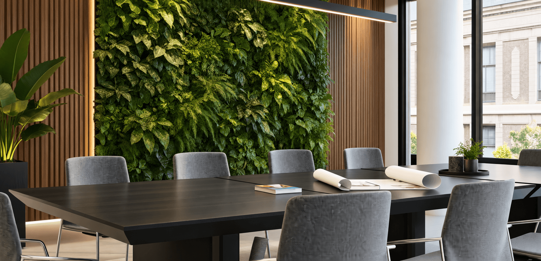
Branding, Web, Interiors
Turning service apartments into a brand people trust.

( 00-01 )
ABOUT THE PROJECT
Whytescape set out to offer high-end serviced apartments without losing the warmth that makes a stay feel like home. As a new name in a crowded market, it needed a brand that could balance sophistication and ease without falling into the generic luxury look common in hospitality.
We built Whytescape's identity around that same balance: polished enough to signal quality, warm enough to feel welcoming. That identity carried straight through to the booking website, so a guest's first impression online matched the experience waiting for them at check-in, starting with the first click.
( 00-02 )
BRANDING & WEB
Whytescape entered a category where competitors often looked almost identical, from neutral colors and stock-style photography to generic luxury language. Standing out meant making bolder choices while still giving guests the trust and confidence to book somewhere unfamiliar.
We chose warmer colors and a more distinctive photography style than most competitors in this space are willing to try, trading the usual safe, generic look for something guests would remember the next time they compared places to stay.


( 00-03 )
INTERIOR
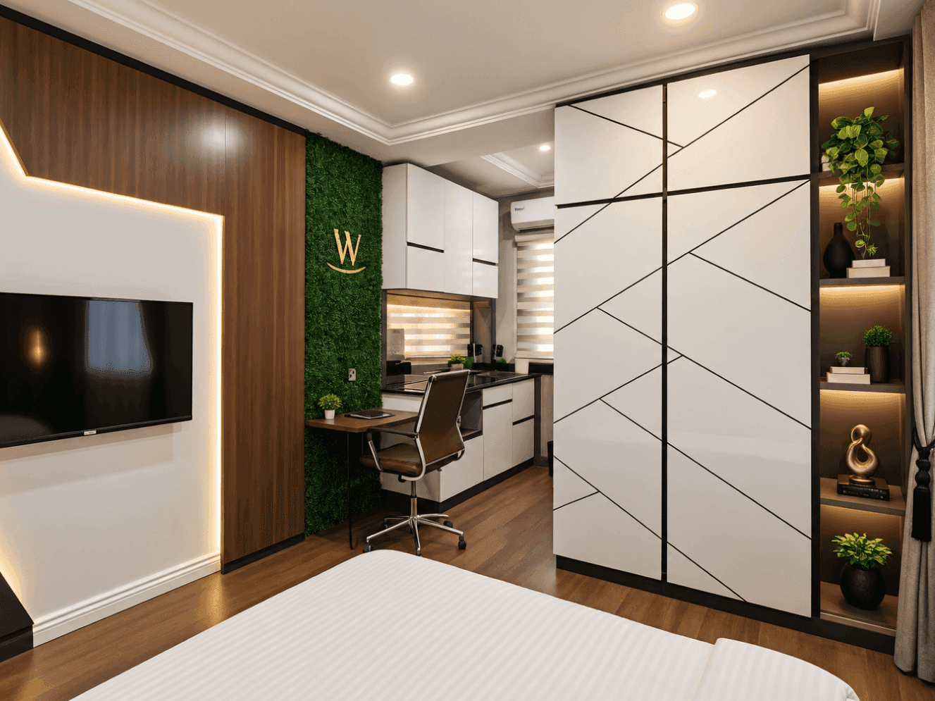
For a hospitality brand, the interior isn't a supporting detail. It's the product a guest pays for and lives in during their stay. We carried the same balance that shaped the brand and the website into the physical space too: apartments that felt genuinely warm and lived-in, rather than a standard, sterile hotel room, while still polished enough to justify a premium stay.
We carried the brand's colors and materials directly into the apartments. As a result, a guest's experience of the space matched what they'd already seen on the website and felt during booking, rather than feeling like two separate things.



( 00-03 )
DISCOVER MORE